TRADEMARKS

Pro Watercross Graphic Standards & Logo Use
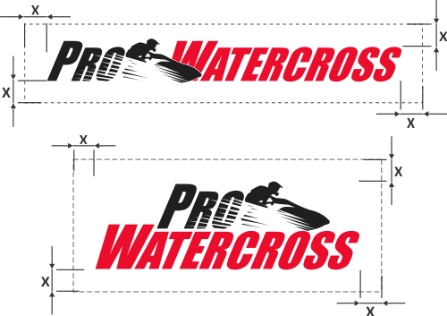
Clear Space Around Logo
The complexity of the Pro Watercross logo requires that it be given ample breathing room when used in layouts. The measurement of half the height of the logo shown here as “x” is to be used as a consistent measurement of the minimum amount of space to be given to the logo on all four sides.

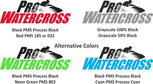
Logo Colors
The logo is made up of 2 colors – Red & Black – or 2 shades of Gray. The following chart provides accurate specifications for PMS and Grayscale uses of the logo.

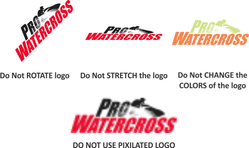
DO NOT …
There are certain things that should not be done to the Pro Watercross logo. A limited number of examples are shown here. As a general rule, try to use the Pro Watercross logo as simply as possible.

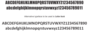
Typography
Impact is the typeface used in the lettering of the Pro Watercross logo. This is a stable, professional & approachable typeface that can also be used throughout other communication materials for the Pro Watercross to retain brand strength. The Impact family offers a wide variety of styles and weights which can be used for display, header, body copy and just about any other needs.

DOWNLOAD USER GUIDE
FILES FOR DOWNLOAD
IMAGES TO DOWNLOAD
IMAGES WITH WHITE OUTLINE
IMAGES WITHOUT WHITE OUTLINE